Here are the first lines of work about possible EEE visual identity and baseline, through whole progression of ideas (please don’t consider style, wich will be improved later)
Research started from general symbols around prosperity, equity, balance, and quite quickly turned on ideas toward visualising creative and opened cooperation, and expressing common products wich could get out of that
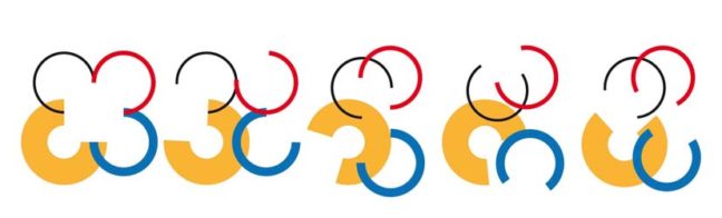
The figures of “intersection” and “complementarity” in contributions who lead to a shared result (what could be less banal that a star to express it…) appears to be the richest at this first step
Another alternative would have been the figure of cherubim (sort of angel with four wings, one for each partner)
It appears that main actual message should be “work in progress” upon environmental themes instead of “final result” as exact final product won’t be found before the end of the project
This os the reason why provisory identity shows different combinations of four different petals creating an scalable flower